TL;DR: The person searching "assisted living near me" is usually not the person who will live there. It is their daughter, at 11pm, three states away, feeling guilty. Build the site for her. Licence number visible, real photos, honest pricing structure, and a way to arrange a visit without a phone call she is dreading.
We built a concept site for Minneola Place, a family-owned assisted living community in Lake County, Florida. The first thing we did was throw out the assumption baked into almost every senior living website we looked at.
A note before we go further, because it matters: this business never hired us. We built that site unasked, as a demonstration of what we would do differently, and it is not their official site. It sits on our prototypes page with that label attached to it, and if the owner ever wants it taken down it comes down the same day.
Here is the assumption: that the reader is the resident.
They are usually not. The resident is often not the one browsing at all. The browser is an adult child, three states away, who got a phone call about a fall and has been reading tabs about levels of care ever since. She is tired, she feels guilty, and she has about four minutes before she has to be a parent again herself.
Every design decision below follows from taking that seriously.
Lead with the thing that makes you legitimate
In Florida, an assisted living facility carries a licence number. Put it in the header.
That sounds like a compliance detail. It is actually the single fastest trust signal on the page, because the person reading has just learned that this industry is licensed and is now wondering how to tell a real operation from a nice-looking one. A licence number in the header says: look me up. Almost nobody will. That is not the point. The point is that you offered.
The same logic applies to the address. A senior living site that hides its street address behind a contact form is asking a family to trust it with a parent while declining to say where it is.
Photograph the actual building
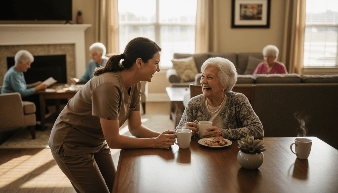
Stock photography is a plague in this category. You have seen the same silver-haired couple laughing on a park bench across nine different communities in one search session.
Here is the problem with it beyond taste. A family shortlist is usually two or three places, and they will drive to all of them. If your photos do not match the building, you have set up a small betrayal for the moment they pull into the parking lot. Better to show a real hallway that needs a coat of paint than a rendered atrium you do not have.
Show the rooms. Show a real meal. Show the outdoor space in the season it actually looks like.
Say something honest about money
Most communities will not publish a monthly rate, and there are defensible reasons: care levels vary, needs change, and a number without context invites the wrong comparison.
Fine. Publish the structure instead.
- What does the base rate include, in plain words
- What moves someone to a higher level of care, and roughly what that changes
- What is billed separately, like medication management or transport
- Whether there is a community fee, and whether it is refundable
A family that understands your pricing structure will call you. A family that cannot tell whether they are looking at three thousand a month or eight will call the place that told them.
This is the same principle behind publishing what a website costs, which we argue for in our piece on website pricing. Vagueness reads as something to hide, even when it is just caution.
Design for the eyes actually reading it
Some of your readers are in their seventies and eighties. Some are adult children in their fifties who have started holding their phone further away and have not admitted it yet.
Practical decisions that follow:
- Body text at 18px minimum, and do not go below 16px anywhere
- Real contrast, not grey-on-lighter-grey, which fails WCAG contrast rules and also just fails people
- Tap targets big enough for an unsteady hand
- Never put critical information in an image, because screen readers cannot read it and neither can someone who zoomed to 200 percent
We wrote a fuller version of this in website accessibility basics. In this industry it stops being a nice-to-have. Your audience is definitionally people with changing vision, hearing, and motor control.
Give them a way in that is not a phone call
The tour is the conversion. Everything on the page exists to produce a visit.
But asking a stressed person to call during business hours is asking a lot. She is researching at 11pm precisely because that is when she has a free minute. Give her a booking form that takes a real time slot, and tell her what will happen when she arrives and roughly how long it takes.
If you can only manage a callback request, say when you will call. "We will call you back the next business morning" beats a form that vanishes into nothing.
The local search side
Assisted living is an intensely local search. Someone is looking for a community near a specific town, often the town a parent already lives in.
That means the ordinary local SEO work matters more here than in most categories:
- A Google Business Profile for the individual community, not just the parent company
- Consistent name, address, and phone everywhere, which we cover in citations and NAP consistency
- Reviews, handled like an adult, including the bad ones
That last one deserves a warning. This category attracts emotionally heavy reviews, sometimes from family members processing grief rather than reporting a service failure. You still have to respond, and you still have to do it without ever confirming that a named person lived in your building. Our guide to handling negative reviews covers the general shape. In senior care, add a lawyer to the loop before you publish anything specific.
What we would build, in order
If you run a community and you are starting from a page your management group made in 2019, this is the order I would fix it in:
- Licence number, address, and phone in the header
- Real photos of your actual building, even imperfect ones
- A plain-language page on levels of care and what changes between them
- Pricing structure, if not price
- Tour booking with real time slots
- A community-specific Google Business Profile, fully filled in
- Accessibility pass on type size and contrast
None of that is exotic. It is mostly the discipline of remembering who is on the other end of the screen at 11pm, and building for her instead of for the brochure.
If you want to see the version we built as a demonstration, it is on our prototypes page, labelled as the unsolicited concept it is. And if you run a community and want one of your own, tell us about it.