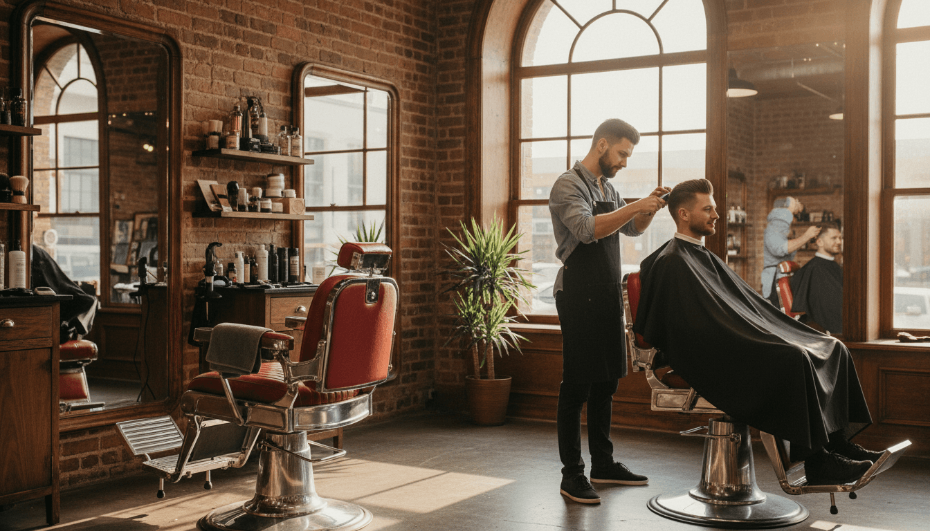
TL;DR: Nobody browses a barbershop website. They are checking one of four things: can I get in today, how much, where are you, and do the cuts look good. Put booking first, put prices up, and stop making people hunt.
We built a concept site for Prestige Barbershop, an upscale shop with locations around Orlando. The design brief came down to one sentence: booking is the only thing that matters, so it should be the first thing you see and it should follow you down the page.
A note before we go further, because it matters: this business never hired us. We built that site unasked, as a demonstration of what we would do differently, and it is not their official site. It sits on our prototypes page with that label attached to it, and if the owner ever wants it taken down it comes down the same day.
That sounds reductive. It is not. Watch how anyone actually uses a barbershop site on a phone and you will see the same four questions every time.
The four questions, in order
- Can I get in, and when? Usually today or tomorrow.
- What does it cost? For their specific cut, not a range.
- Where are you and is there parking?
- Are the cuts any good? Which means photos, not adjectives.
Everything else on a barbershop website is decoration. The story of how the shop got started is lovely and it belongs further down.
Booking goes in the hero and never leaves
Put the booking button in the hero. Then keep it visible in a sticky bar as the page scrolls, because the moment someone decides is unpredictable. Sometimes it is the price list. Sometimes it is a photo of a fade that looks like the one they want.
If you take walk-ins, say so in the same breath, and be specific about what that means. "Walk-ins welcome" is weaker than "walk-ins welcome, though Saturdays before noon usually run a wait." The second one is a real person talking, and it manages the expectation that produces a bad review.
Publish your prices
Every argument for hiding prices is an argument for having a worse day.
Someone who was never going to pay your rate finds out by phone instead of by website, and now you are having that conversation with clippers in your hand. Someone who would happily pay it cannot tell whether you are a fifteen dollar shop or a fifty dollar shop and picks the one that told them.
Break it out the way customers think:
- Adult cut, kids cut, senior and veteran rates if you offer them
- Beard work, line-ups, hot towel shave
- Whatever the bundle is that most people actually book
If prices differ by barber level, say that too. It reads as a real shop rather than a hidden upsell.
Photos of your work, taken on a phone, are fine
You need cuts, not a moodboard. Real heads, real light, real clients who said yes.
Two practical notes. Get permission, especially for anyone under 18. And shoot the back of the head, because that is the angle a client cannot see in the mirror and the one they are secretly most anxious about.
Compress them properly before they go up, or the gallery becomes the slowest part of your site. We covered the mechanics in image optimization and speed.
Multi-location is a page each, not a list
If you have three shops, you need three pages.
One page listing three addresses splits your relevance across all of them and ranks properly for none. Each location deserves its own page with its own address, phone number, hours, team, and photos, and its own Google Business Profile pointing at it.
Someone in Casselberry searching "barber near me" should land on the Casselberry page, not on a homepage that makes them figure out which of your shops is closest.
The Google Business Profile does half the work
For a barbershop, the profile is arguably more important than the website. It is what shows in the map pack, it carries the reviews, and it holds the hours that people check at 6pm on a Thursday.
Two habits that compound:
- Post to it regularly. Cuts, schedule changes, a new barber starting. We wrote about what actually belongs there in Google Business Profile posts.
- Ask for reviews out loud, at the chair. The best moment is the ten seconds after someone looks in the mirror and likes what they see. Our review strategy guide covers how to ask without being weird about it.
The page most shops forget: hiring
Barbershops run on chairs being filled, and good barbers move.
If you rent chairs or hire, build a real page for it. What the split is, what is provided, what the shop expects. The Prestige concept we built put "barbers wanted" right in the rotation on the homepage, because a shop with an empty chair is losing more money per week than most marketing will ever make it.
It also quietly signals to customers that the shop is busy enough to need people, which is not nothing.
Deposits, no-shows, and the sentence that prevents both
Every shop that moved to online booking discovers the same problem about three weeks in. Booking got easier, so people book more casually, and casual bookings do not show up.
The website is where you fix that, and it takes one sentence rather than a policy page.
Put your cancellation window right next to the booking button, not buried in terms. "Free to cancel up to two hours before. After that we charge half." People read it at the exact moment it is relevant, which is the only moment it works.
If you take a card to hold the slot, say so before they start the flow, not on the last screen. A surprise card field at step four is where bookings get abandoned, and the person who bailed now thinks you were being sneaky rather than sensible.
Two more things worth stating plainly, because they cause most of the friction:
- What happens if they are late. Ten minutes late usually means a shorter cut or a reschedule. Say which.
- Whether a specific barber is guaranteed. If someone books with a named barber and gets whoever is free, that is a bad review waiting to happen.
None of this is glamorous. It is the difference between a booking system that fills chairs and one that just moves the argument online.
Keep your hours true, especially the holidays
This is the least interesting item on the list and probably the highest return.
Wrong hours generate a specific kind of anger. Someone drove to you, found a locked door, and now has both a wasted trip and a haircut they still need. That is a one-star review with a genuine grievance behind it.
Your hours live in three places: the website, the Google Business Profile, and the booking system. All three have to agree, and the profile is the one people actually check. Set your holiday hours in advance rather than the morning of, because the morning of is when you are busy.
Mobile is not a version of the site, it is the site
Almost all of this traffic is a phone, often outdoors, often one-handed, sometimes while walking.
That means big tap targets, a phone number that dials on tap, an address that opens Maps on tap, and text you can read without pinching. We go deeper in mobile-first design, but for a barbershop the test is simpler: can you book a cut with one thumb, standing up, in under thirty seconds?
If not, the site is not finished.
The short version
Booking in the hero and sticky thereafter. Prices published. Real photos including the back of the head. A page per location. A Google Business Profile you actually post to. A hiring page if you have a chair to fill.
That is most of it. The concept we built for Prestige is on our prototypes page, labelled as unsolicited, and if you run a shop and want your own, start here.