TL;DR: A parent choosing a daycare is not shopping. They are deciding who to hand a child to. Lead with the licence number, real photos of the real rooms, an honest word about cost, and a tour booking that does not require a phone call during working hours.
Most daycare websites are built like a small business brochure. Hero image, warm adjectives, a contact form. That is the wrong shape, because the person reading is not doing what a customer does.
They are doing something closer to due diligence, and they are doing it anxious.
Put the licence number in the header
In Florida a child care facility is licensed, and the licence carries a number. Put it where it can be seen without scrolling.
That sounds like a compliance footnote. It is the fastest trust signal you have, because the parent reading has just discovered this industry is regulated and is now trying to work out how to tell a real operation from a nice-looking one. A licence number says: look me up. Most will not. That is not the point. The point is that you offered before being asked.
The same goes for your address. A daycare site that hides its street address behind a form is asking a family to trust it with a child while declining to say where the building is.
Photograph your actual rooms
The stock-photo problem is worse here than anywhere else. You have seen the same laughing toddlers on four different centre websites in one search session.
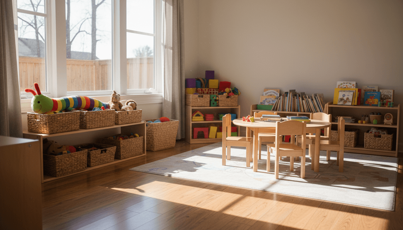
Beyond taste, there is a practical failure. A parent shortlist is two or three centres and they will visit all of them. If your photos do not match the building, you have arranged a small betrayal for the moment they walk in. A real room that could use fresh paint beats a rendered playroom you do not have.
Photograph the rooms by age group, the nap space, the outdoor area in the season it actually looks like, and the entrance a parent will use at drop-off.
On photographing children: only with written permission from each family, and many centres decide the paperwork is not worth the risk. That is a reasonable call. Empty rooms photographed well are fine.
Say something honest about cost
Most centres will not publish a rate, and there are real reasons. It varies by age group, by days per week, by whether meals are included.
So publish the structure instead.
- What the base rate covers, in plain words
- How it changes by age group, and roughly when a child moves up
- What is billed separately: meals, nappies, late pickup, registration
- Whether there is a deposit and whether it is refundable
A parent who understands your structure will call. A parent who cannot tell whether they are looking at 700 a month or 1,600 will call the centre that told them. This is the same argument we make about publishing what a website costs: vagueness reads as something to hide even when it is only caution.
The waitlist is a feature, not an apology
Most good centres have a waitlist. Most websites treat it as bad news to be buried.
Turn it around. A waitlist is social proof that you are worth waiting for. Say roughly how long it runs by age group, say how the list works, and let people join it from the site. A parent who joins a waitlist in month two is a family you have for four years.
The one thing you must not do is let the list become a black hole. If someone joins and hears nothing for six months, you have converted goodwill into a bad review.
Ratios, staff, and the questions nobody asks out loud
Parents want to know who is actually in the room. They rarely ask directly on a tour, because it feels rude.
Answer it on the site. Your staff-to-child ratio by age group. How long your lead teachers have been with you. What qualifications your staff hold. Whether there is always someone on site with a paediatric first aid certificate.
Say it plainly and without adjectives. "Two staff to eight children in the toddler room, and both of our toddler leads have been here over five years" does more work than a paragraph about your nurturing philosophy.
Food, naps, and the day itself
Parents want to picture the day. Most sites describe a philosophy instead.
Write the actual shape of it. When children arrive, when they eat, what a typical morning looks like in each room, when they nap and for how long, what happens outdoors and in what weather. If you provide meals, publish a sample week's menu. If parents pack lunch, say what you can and cannot refrigerate or heat.
This is not filler. A parent trying to decide between two centres will pick the one whose day they can see. It also quietly answers the questions people are embarrassed to ask, like what happens if a child will not sleep.
Say what happens when something goes wrong
Every parent has the same private worry and almost nobody asks it on a tour.
Answer it on the site, briefly and without drama. What your sickness policy is and when a child has to be collected. How you handle an injury and when you call. What your allergy and medication procedure is. Whether the building is secured during the day and how pickup is authorised.
A centre that has written this down reads as a centre that has thought about it. A centre that has not reads as one you will find out about the hard way.
The tour is the conversion
Everything on the page exists to produce a visit. So make booking one easy at the hour a parent is actually browsing, which is after bedtime.
Give them real time slots. Say how long a tour takes, whether they should bring the child, and what they will see. If you can only manage a callback request, commit to a window: "we will call you back the next working morning" beats a form that vanishes.
Design for a phone held in one hand
Half your traffic is a parent on a phone with a child on the other hip.
Big tap targets. A phone number that dials on tap. An address that opens Maps on tap. Type large enough to read without pinching. We cover the general case in mobile-first design, but the daycare version of the test is simple: can a tired parent book a tour with one thumb in under a minute?
Accessibility matters more here than most sites admit, too. Some of your parents have disabilities, and some of your children do. Our accessibility basics covers the floor.
The local search side
This is an intensely local search. Someone is looking for care near their home or on the route to work.
That means the ordinary work matters: a complete Google Business Profile with current hours and real photos, consistent name and address everywhere, and reviews handled like an adult.
Reviews in this category run hot. A parent who had a bad week will write something raw, and a parent whose child is thriving rarely thinks to post at all. Ask at pickup, at the moment somebody says something kind about their child's day. Our reviews guide covers the mechanics, and handling negative reviews covers the harder half. In childcare, add one rule: never confirm publicly that a named child attends your centre.
What we would build, in order
- Licence number, address, phone in the header
- Real photos of the actual rooms, by age group
- Ratios, staff tenure, qualifications, stated plainly
- Cost structure, if not the number
- Tour booking with real time slots, available at 10pm
- Waitlist signup, framed as demand rather than apology
- A community-specific Google Business Profile, fully filled
None of that is clever. It is the discipline of remembering that the person reading is not buying a service. They are deciding whether to trust you, and every one of those items is evidence.
If you run a centre and want one of these, tell us about it.